May 21 2024
CSS Flex: Zero to Hero
Flex is the an finshed word for flexible. Means creating flexible elements that can dance how ever they want in the DOM. Whether you want to center a div, showing a products list horizontally, or making responsive design. In short anything you want flexible is what flex does. And this post is all about flex. From zero to hero. Whether you're already familiar or new to it: you will learn something. Let's jump in.
Flex container is parent element or the higher level div . In this parent element you will to set the `postion: flex` so the DOM can understand you're applyling flex for the child elements.
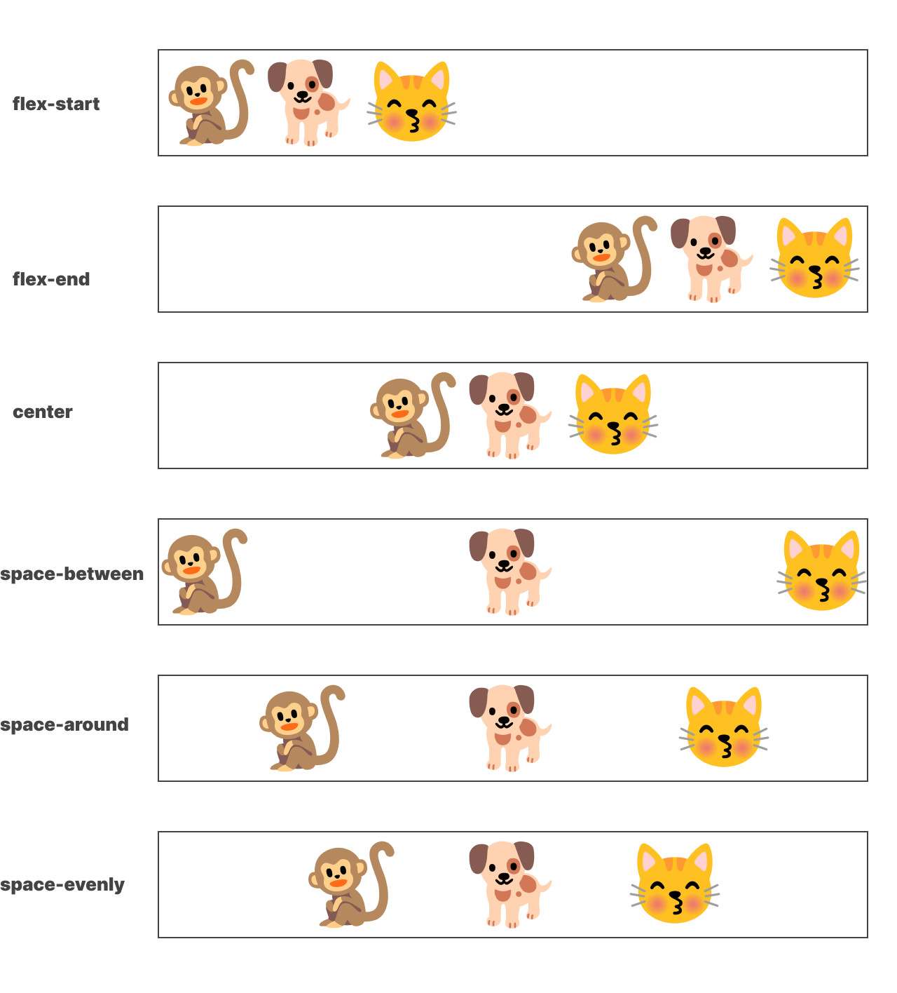
This will set each blocks from right to left. It's the default behaviour of flex. If you don't like how they arranage (from left to right) you can add justify-content: end. This will start placing the elements from the opposite side (Right to left).
Here is another propeties that will do different postion variations. Start, center, Space Between, Around. Change the justify-content value to different value and see postion variation.
Align Items